
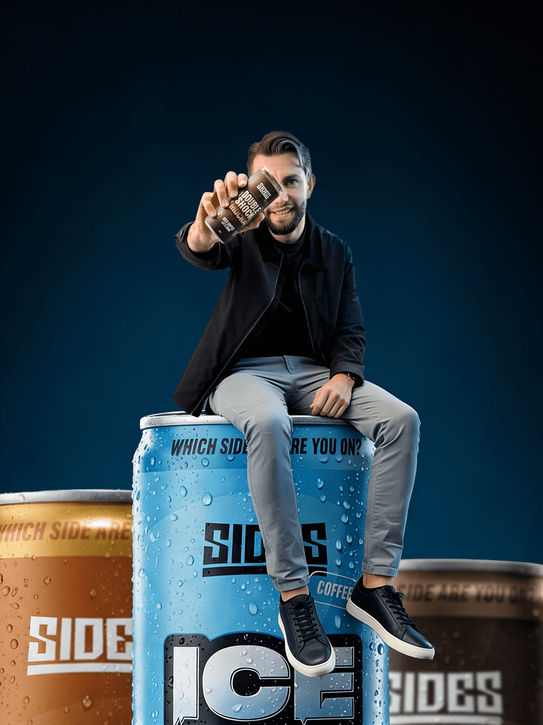
More insights.
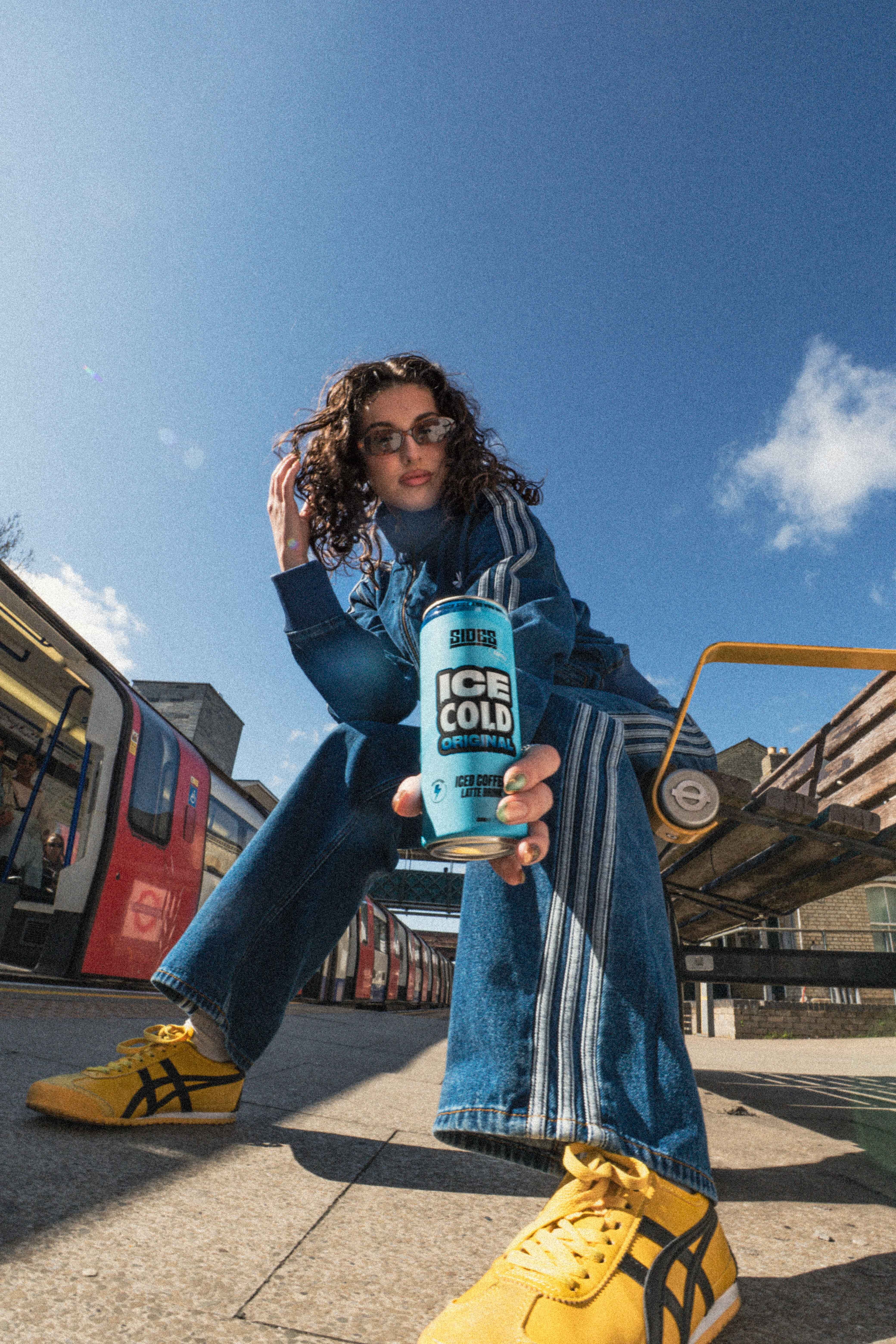

SUBSCRIBE TO OUR NEWSLETTER.
Where the COLLAB team shares updates on our latest projects, industry milestones, and expert insights into the rapidly evolving creator economy, brand innovation, and cultural trends shaping consumer behaviour.
Most creator brands start with a feeling: A colour palette lifted from a mood board, a font that looks right, a logo knocked together before the launch window closed. For a while, that can work just fine. The audience already knows the face, they trust the voice, the vibe carries everything. Then someone wants to put the product on a shelf, and suddenly, the vibe isn’t enough. That’s where my job begins. I’m Nathan, Head of Design at COLLAB, and what I do is translate the unspoken energy of a creator’s world into an identity system that can hold its own next to Pepsi on a retail shelf. It’s not decoration, it’s architecture.
DESIGN IS A DIAGNOSTIC PROCESS NOT A DECORATIVE ONE
The first thing I do when I come onto a creator brand project is build a brand foundation. That means getting into the soul of the brand: the tone of voice, the mission, the values, the core personality. The verbal and strategic groundwork. Only once that’s solid does the visual work begin. My job is to build the structure around it.
Because a brand isn’t just about looking good it’s about building brand loyalty, a culture the consumer can relate to that will ultimately drive repeat purchase. If it doesn’t convert on the shelf, it hasn’t done its job.
Design that can’t answer those questions isn’t a brand, it’s wallpaper.
SITTING BESIDE THE BRAND, NOT INSIDE IT
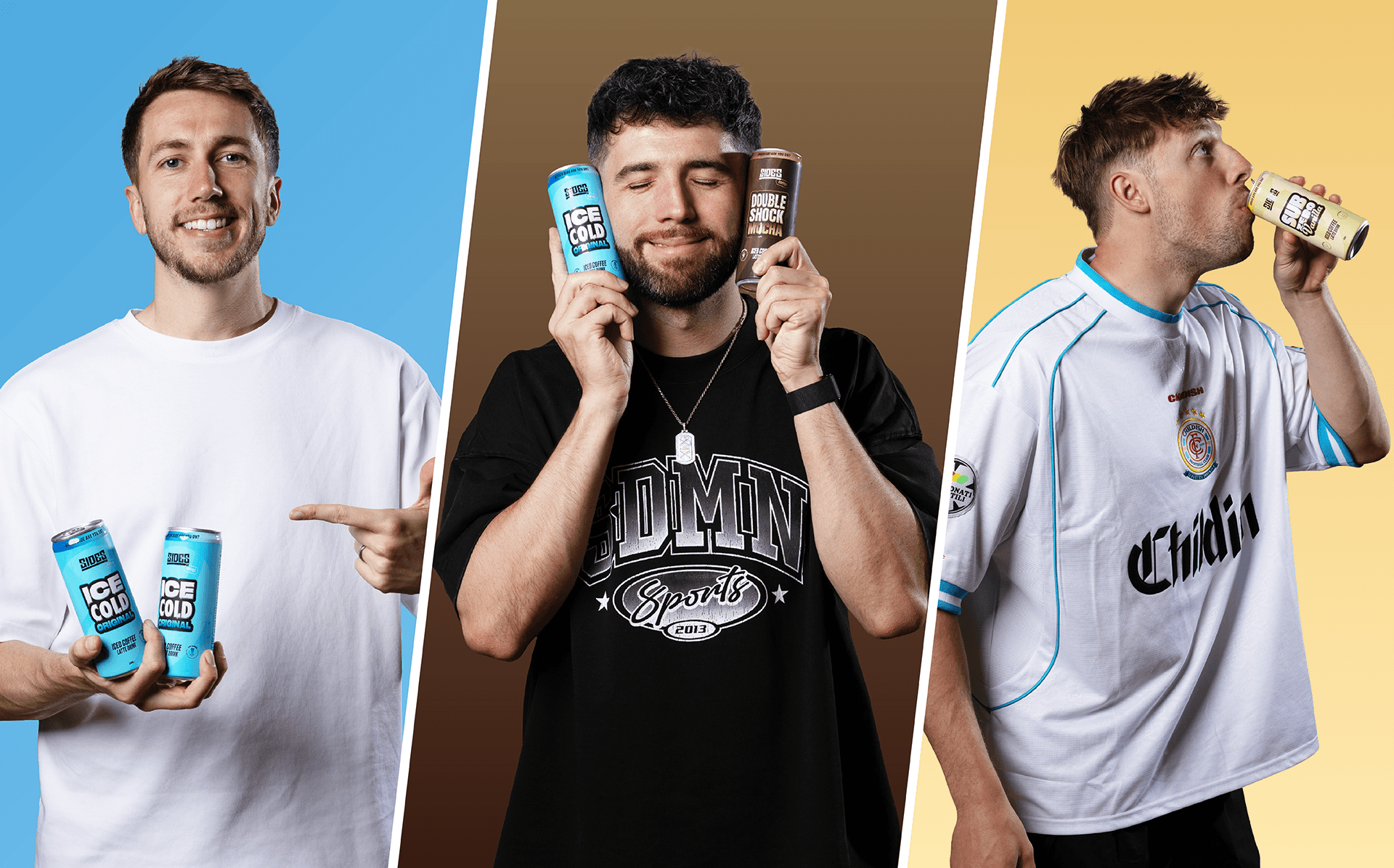
Take the Sidemen, one of the most culturally significant creator collectives in the world. They’ve built an audience over a decade on banter, loyalty, and a shared sense of humour that feels completely natural because it is. Their aesthetic is already established, their community already has an identity, and they already had a brand we needed to work with: Sides, their restaurant concept with real presence and real equity.
So the question I had to answer wasn’t “what should this brand look like?” It was “how do we extend Sides into a new category, stay true to the creators, and build something strong enough to stand on its own?”
We weren’t starting from scratch. We were becoming an extension of an established brand while making Sides Coffee fit for purpose for the consumer and the convenience retail environment. That meant holding the existing brand equity with real respect, carrying the creators’ energy forward, and building something that felt like a natural next chapter rather than a bolt-on.
The strategy we landed on is what I call Parallel Entities. The brand doesn’t live inside the creators. It lives beside them. It’s recognisable as theirs, it carries their energy, but it has the industrial strength to stand alone. When an 18-year-old picks up a Sides Coffee can from a shelf, with no Wi-Fi to check who made it, the design has to do all the talking. The brand has to be self-sufficient.
That’s a very different brief to “make it look like their YouTube channel,” and getting that distinction right is what separates a brand that scales from one that plateaus.
TRANSLATING THE UNSPOKEN INTO A SYSTEM
Here’s the part of the process most people don’t see. Before any typography decisions are made, before a single colour is chosen, I’m doing research that looks nothing like design.
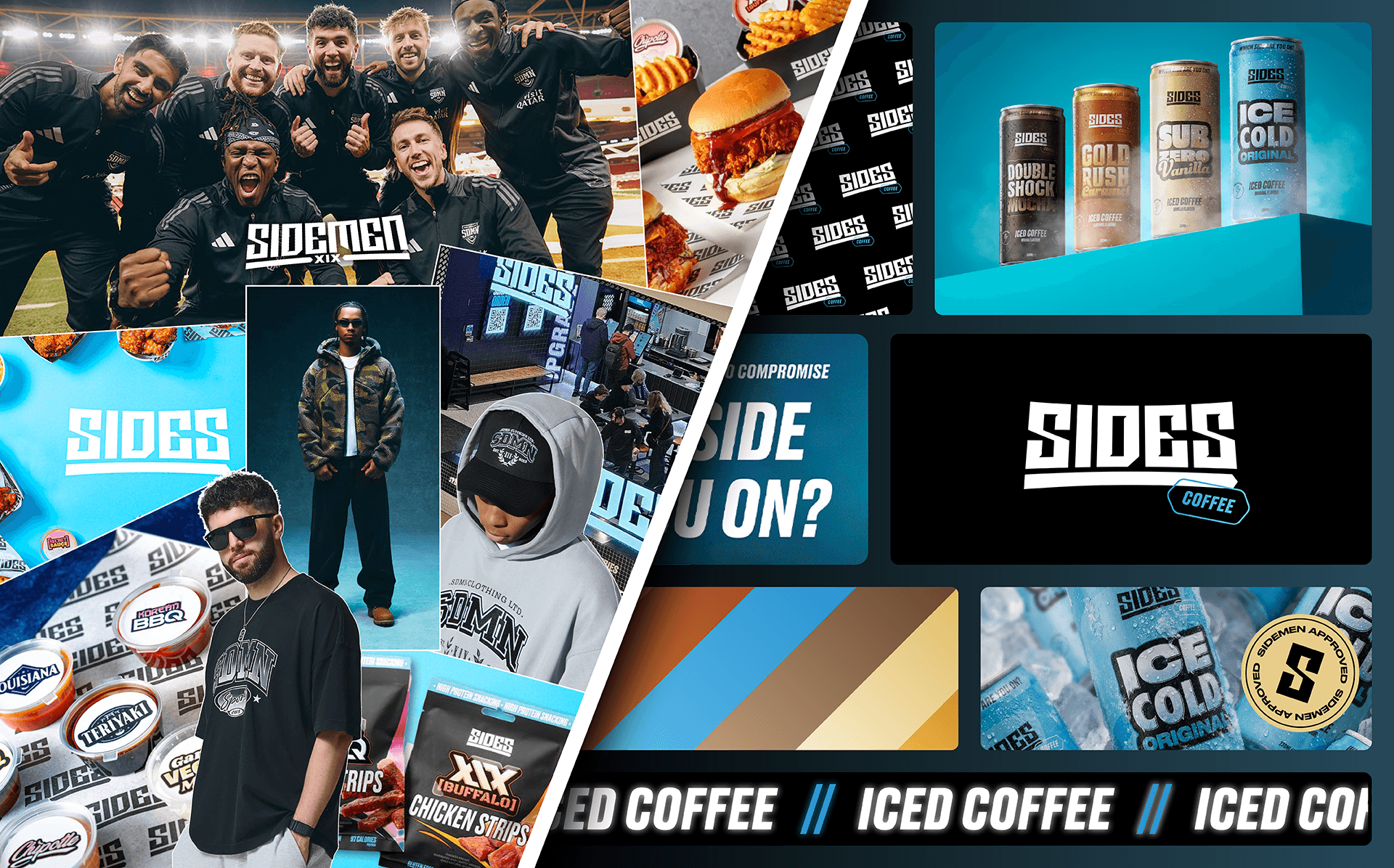
I’m looking at what the creators wear, the fashion labels they gravitate towards, the interiors that appear in the background of their videos, the energy of their thumbnails, the pace of their edits, the things they reach for without thinking, etc. With Sides Coffee, that research included the existing Sides restaurant brand itself: its visual language, its interior world, the experience it had already built for its customers. All of that is valuable data. It is the unspoken visual language of who they are and what they’ve already built, and my job is to make it precise and purposeful.
With the Sidemen, that process gave us a clear picture: bold but not loud, confident but accessible, the kind of aesthetic that works in a streetwear context and a convenience store aisle at the same time.
There’s also what I call the Texture of Trust: the weight of a can, the matte finish on a label, the way packaging feels when you pick it up. These things tell the consumer more about a product’s quality than a 15-second video ever could, and they’re what drive that first purchase. Tactile design is a signal that says this is real, this was thought about, this is worth your money. If you get that right you don’t just get a sale, you get a returning customer! That is where the real return on investment lives.
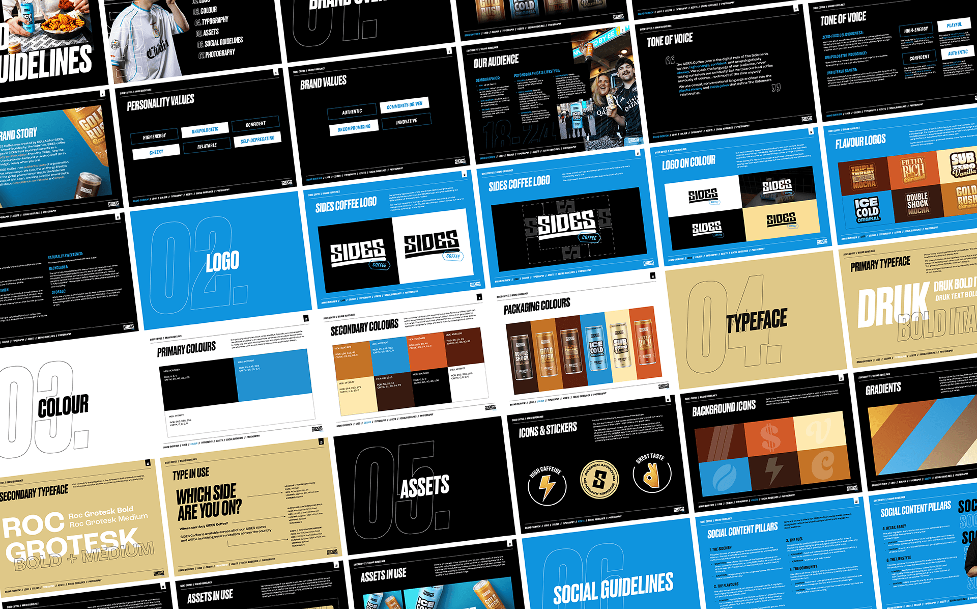
THE SCALE BARRIER: WHY GUIDELINES ARE THE MOST UNDERRATED TOOL IN BRAND
Creators are agile by nature. They move fast, they change their minds, they pivot when something isn’t working. That’s a strength in content. In CPG retail, it’s a liability.
Retail is rigid, they don’t care that the creator fancied a rebrand last Tuesday. A third-party activation won’t wait for sign-off on a new colour direction. From a design perspective they care about shelf presence and loyalty from their customers to keep purchasing the product. This means the brand has to be consistent at every touchpoint across every market, whether the creator is in the room or not.
That’s why we build what I call Unbreakable Guidelines: not a PDF that sits in a Google Drive folder but a living system that defines every rule. The exact colour values, the type hierarchy, the spacing logic, the do’s and don’ts for every format the brand will ever appear in. Whether it’s a TikTok Shop banner or an end-of-aisle display, it looks identical. This is crucial because if it doesn’t, the brand equity bleeds out slowly and nobody notices until the sales data tells a different story.
Scale requires discipline, and guidelines protect everything the creator has built, in every room they’re not in.
DESIGN IS THE ULTIMATE VALIDATOR
A creator can make a fan curious with a video and build a community over years of consistent content, but design is what makes someone pick up a product in a shop and feel like they’re buying something real, something valuable, something worth coming back for. That repeat purchase is the metric that turns content into capital, and it’s the one I’m always designing towards.
If the visuals don’t command respect on the shelf, you haven’t built a brand, you’ve made merch. And merch has a ceiling. That’s the work we do at COLLAB, turning content into capital is some of the most important work in the creator economy right now.
Ready to give your influence a physical form?
Book a meeting with COLLAB.
Most creator brands start with a feeling: A colour palette lifted from a mood board, a font that looks right, a logo knocked together before the launch window closed. For a while, that can work just fine. The audience already knows the face, they trust the voice, the vibe carries everything. Then someone wants to put the product on a shelf, and suddenly, the vibe isn’t enough. That’s where my job begins. I’m Nathan, Head of Design at COLLAB, and what I do is translate the unspoken energy of a creator’s world into an identity system that can hold its own next to Pepsi on a retail shelf. It’s not decoration, it’s architecture.
DESIGN IS A DIAGNOSTIC PROCESS NOT A DECORATIVE ONE
The first thing I do when I come onto a creator brand project is build a brand foundation. That means getting into the soul of the brand: the tone of voice, the mission, the values, the core personality. The verbal and strategic groundwork. Only once that’s solid does the visual work begin. My job is to build the structure around it.
Because a brand isn’t just about looking good it’s about building brand loyalty, a culture the consumer can relate to that will ultimately drive repeat purchase. If it doesn’t convert on the shelf, it hasn’t done its job.
Design that can’t answer those questions isn’t a brand, it’s wallpaper.
SITTING BESIDE THE BRAND, NOT INSIDE IT
Take the Sidemen, one of the most culturally significant creator collectives in the world. They’ve built an audience over a decade on banter, loyalty, and a shared sense of humour that feels completely natural because it is. Their aesthetic is already established, their community already has an identity, and they already had a brand we needed to work with: Sides, their restaurant concept with real presence and real equity.
So the question I had to answer wasn’t “what should this brand look like?” It was “how do we extend Sides into a new category, stay true to the creators, and build something strong enough to stand on its own?”
We weren’t starting from scratch. We were becoming an extension of an established brand while making Sides Coffee fit for purpose for the consumer and the convenience retail environment. That meant holding the existing brand equity with real respect, carrying the creators’ energy forward, and building something that felt like a natural next chapter rather than a bolt-on.
The strategy we landed on is what I call Parallel Entities. The brand doesn’t live inside the creators. It lives beside them. It’s recognisable as theirs, it carries their energy, but it has the industrial strength to stand alone. When an 18-year-old picks up a Sides Coffee can from a shelf, with no Wi-Fi to check who made it, the design has to do all the talking. The brand has to be self-sufficient.
That’s a very different brief to “make it look like their YouTube channel,” and getting that distinction right is what separates a brand that scales from one that plateaus.
TRANSLATING THE UNSPOKEN INTO A SYSTEM
Here’s the part of the process most people don’t see. Before any typography decisions are made, before a single colour is chosen, I’m doing research that looks nothing like design.
I’m looking at what the creators wear, the fashion labels they gravitate towards, the interiors that appear in the background of their videos, the energy of their thumbnails, the pace of their edits, the things they reach for without thinking, etc. With Sides Coffee, that research included the existing Sides restaurant brand itself: its visual language, its interior world, the experience it had already built for its customers. All of that is valuable data. It is the unspoken visual language of who they are and what they’ve already built, and my job is to make it precise and purposeful.
With the Sidemen, that process gave us a clear picture: bold but not loud, confident but accessible, the kind of aesthetic that works in a streetwear context and a convenience store aisle at the same time.
There’s also what I call the Texture of Trust: the weight of a can, the matte finish on a label, the way packaging feels when you pick it up. These things tell the consumer more about a product’s quality than a 15-second video ever could, and they’re what drive that first purchase. Tactile design is a signal that says this is real, this was thought about, this is worth your money. If you get that right you don’t just get a sale, you get a returning customer! That is where the real return on investment lives.
THE SCALE BARRIER: WHY GUIDELINES ARE THE MOST UNDERRATED TOOL IN BRAND
Creators are agile by nature. They move fast, they change their minds, they pivot when something isn’t working. That’s a strength in content. In CPG retail, it’s a liability.
Retail is rigid, they don’t care that the creator fancied a rebrand last Tuesday. A third-party activation won’t wait for sign-off on a new colour direction. From a design perspective they care about shelf presence and loyalty from their customers to keep purchasing the product. This means the brand has to be consistent at every touchpoint across every market, whether the creator is in the room or not.
That’s why we build what I call Unbreakable Guidelines: not a PDF that sits in a Google Drive folder but a living system that defines every rule. The exact colour values, the type hierarchy, the spacing logic, the do’s and don’ts for every format the brand will ever appear in. Whether it’s a TikTok Shop banner or an end-of-aisle display, it looks identical. This is crucial because if it doesn’t, the brand equity bleeds out slowly and nobody notices until the sales data tells a different story.
Scale requires discipline, and guidelines protect everything the creator has built, in every room they’re not in.
DESIGN IS THE ULTIMATE VALIDATOR
A creator can make a fan curious with a video and build a community over years of consistent content, but design is what makes someone pick up a product in a shop and feel like they’re buying something real, something valuable, something worth coming back for. That repeat purchase is the metric that turns content into capital, and it’s the one I’m always designing towards.
If the visuals don’t command respect on the shelf, you haven’t built a brand, you’ve made merch. And merch has a ceiling. That’s the work we do at COLLAB, turning content into capital is some of the most important work in the creator economy right now.
Ready to give your influence a physical form?
Book a meeting with COLLAB.