
More insights.

SUBSCRIBE TO OUR NEWSLETTER.
Where the COLLAB team shares updates on our latest projects, industry milestones, and expert insights into the rapidly evolving creator economy, brand innovation, and cultural trends shaping consumer behaviour.
I have worked on a variety of projects for a range of clients since the start of my career, from full brand builds to simple social media posts; but nothing moves faster, or with higher stakes, than creator-led brands. When your product is tied directly to a real person with an audience, design is no longer just a decoration or something that looks nice… it becomes leverage.
My job as an in-house graphic designer here at COLLAB isn’t to just make things “look cool” and to just run with it; it’s to turn a creator’s personality into product design that sells, scales, and builds long-term brand equity. The difference matters. A lot of brands fail when they try to make something that is just “cool” resulting in end products that don't translate into something the audience understands. Creators don’t fail because their audience doesn’t love them, they fail because their products don’t translate… and that is where our design team is a creator’s secret weapon.
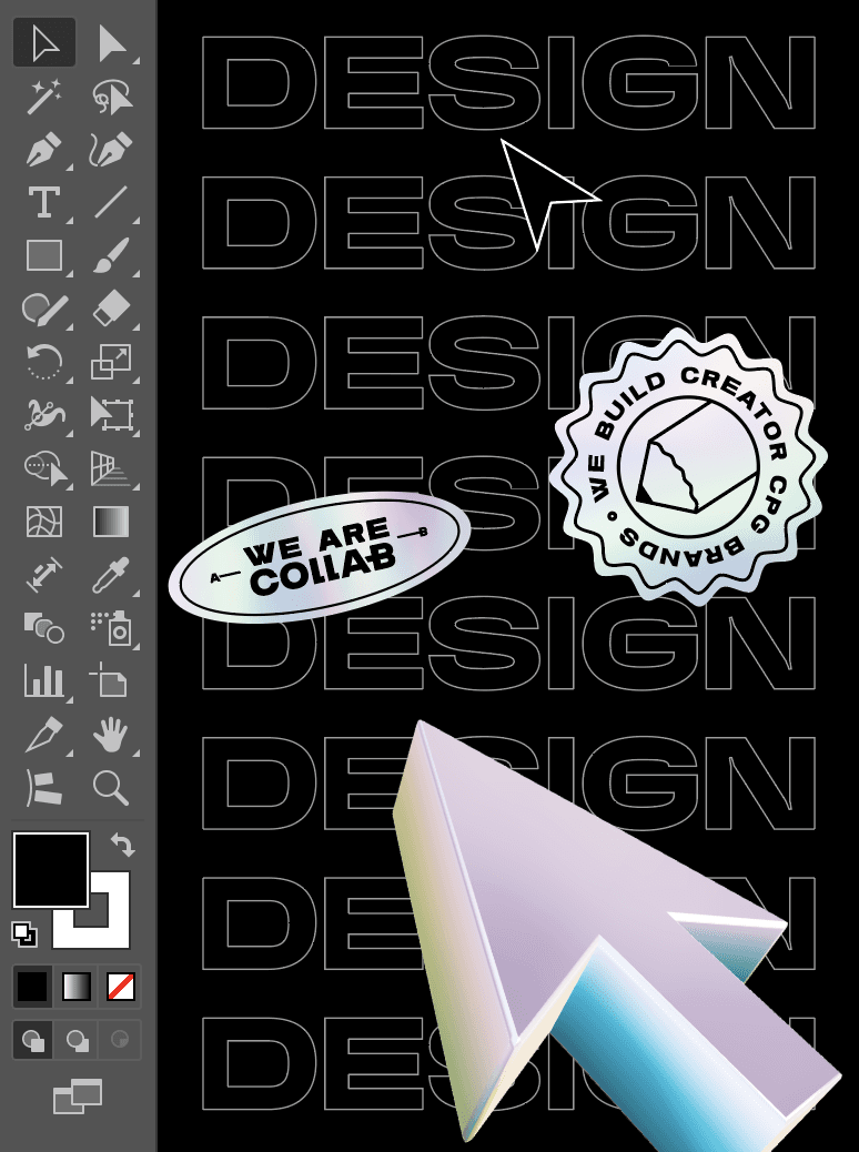
THE COLLAB APPROACH:
I think that one of the biggest misconceptions about brand design, especially working within the creator business, is that everything happens in a quick, linear process:
MOODBOARD - LOGO - PACKAGING - DONE…
Wrong! From day one, our design and branding process is collaborative. I work side-by-side with the development team, fulfillment, marketing, digital, stakeholders, etc, and even more importantly, the creator themselves. With all of our projects, we always ensure that the creator backing the brand is just as invested as we are. We want them to be involved in the process from start to finish to create a brand that not only they love, but a brand they want to get behind.
When designing, ensuring that internally we are working with everyone else across the team ensures we create a design that is fail-proof. Thinking beyond the idea of just making something look good ensures that there is longevity in the brand. We always have manufacturability, compliance and shelf-readiness in mind from the very beginning. That means within our design team, we never just ask, “Does this look good?” Instead, we ask:
“Is it obvious why this will benefit the consumer?”
“Does the brand’s values come through?”
‘Does this resonate with their audience?”
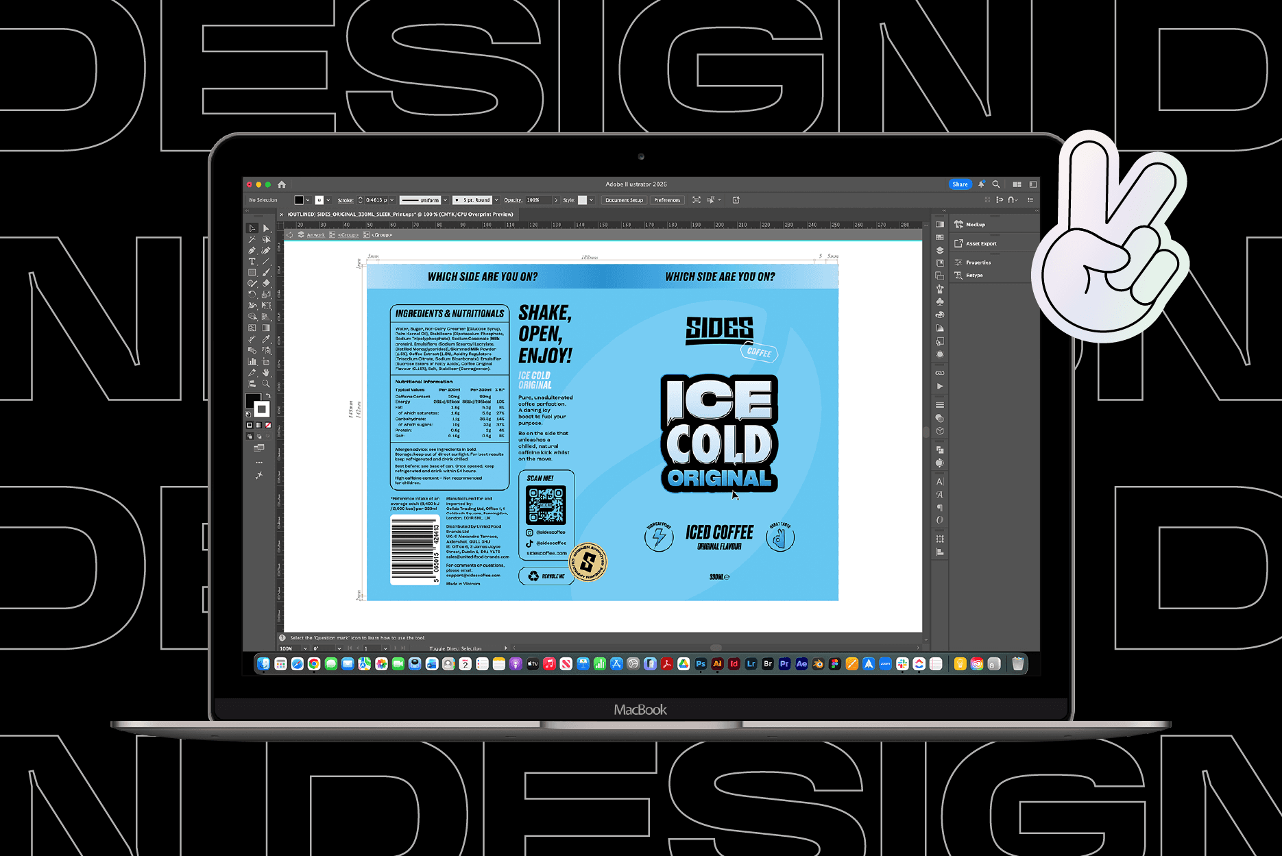
Design iteration is one of the keys to our success. We version, we test, we finesse. We tweak everything! The kerning, colour densities, scaling, finishes, placements… over and over again until we get it right. Sweating the details isn't just perfectionism, it’s respect for the creator’s brand that they are investing themselves into. This is how a creator's CPG brand design becomes a solid revenue driver, not just another visual asset to add to their catalogue.
FROM ‘TIKTOK VIBE’ TO PHYSICAL OBJECT: THE DIGITAL-TO-PHYSICAL TRANSLATION:
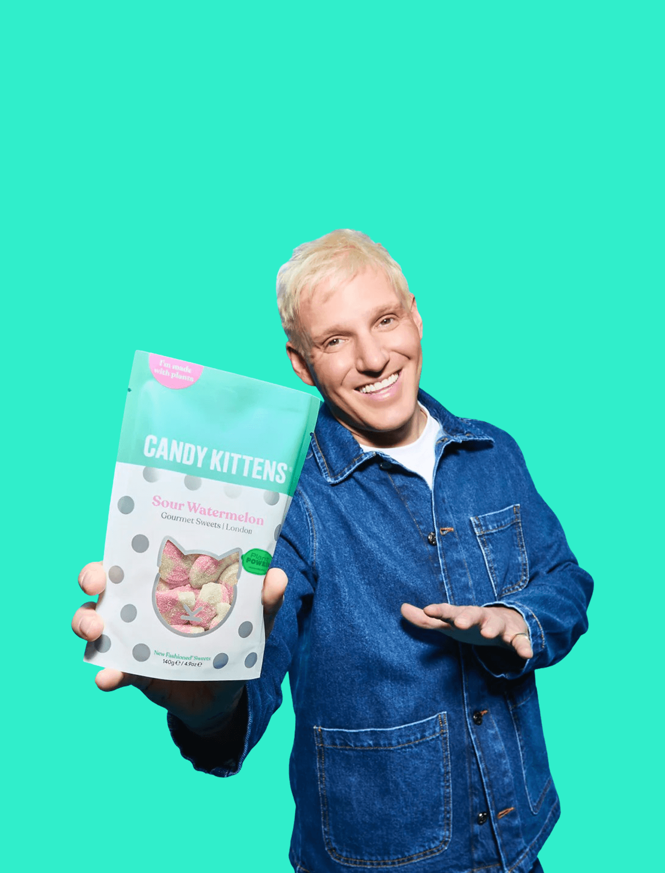
Naturally, most creators start their journeys digitally, whether on Youtube, Tiktok, Instagram, or even Vine! Their brands exist in an RGB landscape: Our phones, tablets, laptops, all glowing screens. But the moment they launch a consumer product, everything changes. Now we are in CMYK. Pantones, coatings, weight, texture etc. This is where the real challenge begins. Translating a ‘Tiktok vibe’ into something that someone wants to hold, trust and ultimately purchase. This is where a lot of creator brands stumble.
A visual identity that slaps online can easily fall completely flat in physical form. Colours shift, type gets muddy, what felt playful on screen suddenly feels cheap in hand. That is why within our design team we obsess over tactile elements: matte versus gloss, soft-touch coatings, embossing, the literal weight of the product in your hand, the details that quietly communicate value before a word is read.
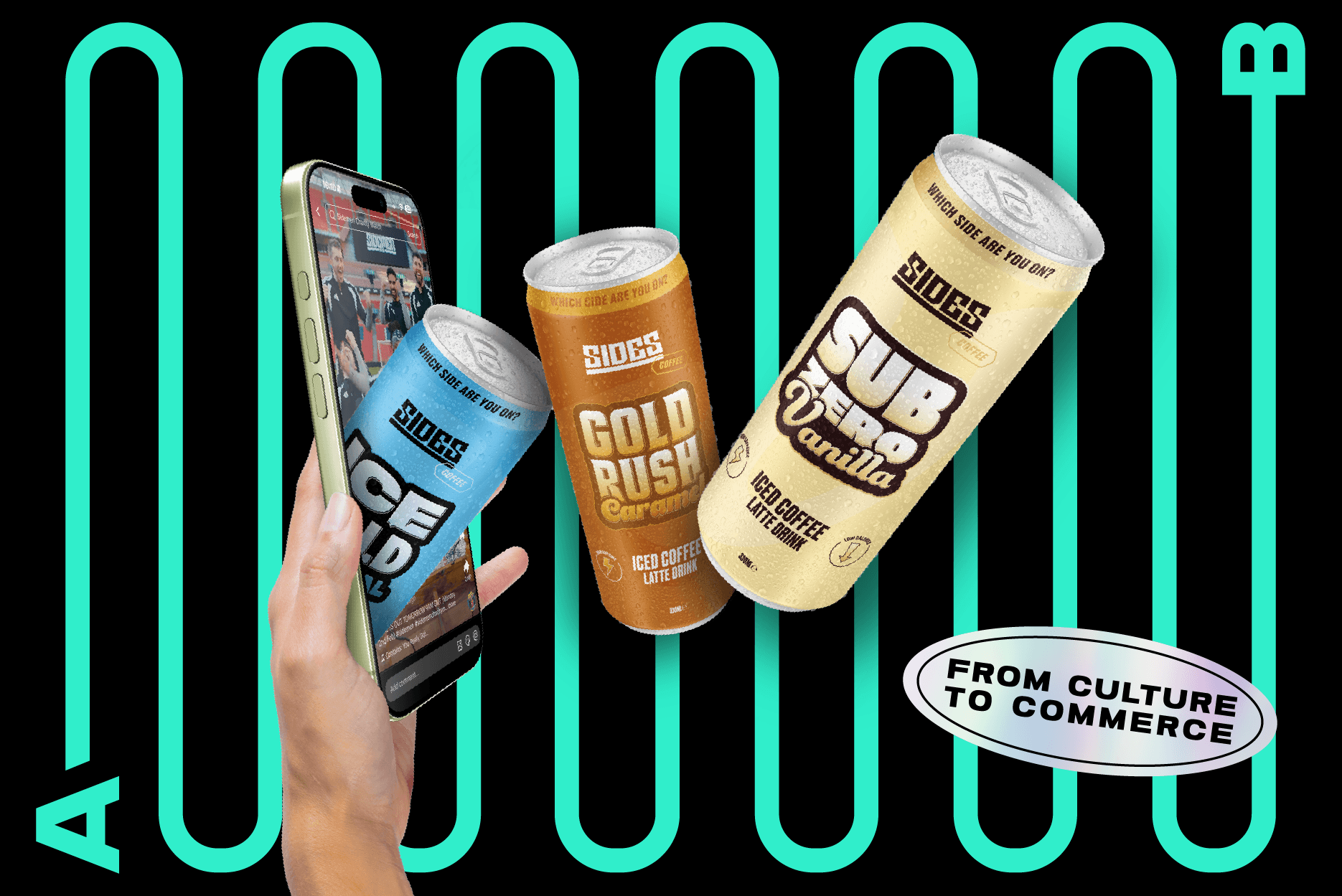
RETAIL IS A THREE SECOND GAME:
In the creator world, especially on social media, we talk about “thumb-stopping” content. Retail works the same way, except now it’s feet. You get about three seconds to win attention on the shelf. That’s why shelf-ready aesthetics aren’t about being loud, they’re about being clear. Strategic design communicates the product’s value proposition instantly. This is where visual hierarchy becomes non-negotiable.
Every piece of packaging must answer the same silent questions:
What is this?
Who is it for?
Why should I care?
Sometimes it is the creator's name that leads, in other instances it is the flavour or function/benefit; especially when the brand needs to reach beyond the creator’s core fanbase.
A wellness product for example can’t rely solely on creator recognition. A new customer needs to understand benefits before they care about personality. That balance, serving the creators audience while inviting a new one, is where great design earns its keep. When we get hierarchy right, the product doesn’t just stand out… it converts.
WHY DESIGN IS WHERE BRAND EQUITY IS BUILT:
Good design doesn’t just make brands look and feel good, it makes them believable. Anyone can just slap a label or logo on a product and call it a day. But when packaging feels intentional, customers trust the brand and product more. When it is consistent, they remember it. When it scales organically, the brand grows without losing its character.
That’s how creator-led brands move away from just being merch to becoming a meaningful business. As a designer, there’s nothing more rewarding than seeing something I obsessed over on screen turn into a physical product that people actually buy. That’s when good design proves its worth.
I have worked on a variety of projects for a range of clients since the start of my career, from full brand builds to simple social media posts; but nothing moves faster, or with higher stakes, than creator-led brands. When your product is tied directly to a real person with an audience, design is no longer just a decoration or something that looks nice… it becomes leverage.
My job as an in-house graphic designer here at COLLAB isn’t to just make things “look cool” and to just run with it; it’s to turn a creator’s personality into product design that sells, scales, and builds long-term brand equity. The difference matters. A lot of brands fail when they try to make something that is just “cool” resulting in end products that don't translate into something the audience understands. Creators don’t fail because their audience doesn’t love them, they fail because their products don’t translate… and that is where our design team is a creator’s secret weapon.
THE COLLAB APPROACH:
I think that one of the biggest misconceptions about brand design, especially working within the creator business, is that everything happens in a quick, linear process:
MOODBOARD - LOGO - PACKAGING - DONE…
Wrong! From day one, our design and branding process is collaborative. I work side-by-side with the development team, fulfillment, marketing, digital, stakeholders, etc, and even more importantly, the creator themselves. With all of our projects, we always ensure that the creator backing the brand is just as invested as we are. We want them to be involved in the process from start to finish to create a brand that not only they love, but a brand they want to get behind.
When designing, ensuring that internally we are working with everyone else across the team ensures we create a design that is fail-proof. Thinking beyond the idea of just making something look good ensures that there is longevity in the brand. We always have manufacturability, compliance and shelf-readiness in mind from the very beginning. That means within our design team, we never just ask, “Does this look good?” Instead, we ask:
“Is it obvious why this will benefit the consumer?”
“Does the brand’s values come through?”
‘Does this resonate with their audience?”
Design iteration is one of the keys to our success. We version, we test, we finesse. We tweak everything! The kerning, colour densities, scaling, finishes, placements… over and over again until we get it right. Sweating the details isn't just perfectionism, it’s respect for the creator’s brand that they are investing themselves into. This is how a creator's CPG brand design becomes a solid revenue driver, not just another visual asset to add to their catalogue.
FROM ‘TIKTOK VIBE’ TO PHYSICAL OBJECT: THE DIGITAL-TO-PHYSICAL TRANSLATION:
Naturally, most creators start their journeys digitally, whether on Youtube, Tiktok, Instagram, or even Vine! Their brands exist in an RGB landscape: Our phones, tablets, laptops, all glowing screens. But the moment they launch a consumer product, everything changes. Now we are in CMYK. Pantones, coatings, weight, texture etc. This is where the real challenge begins. Translating a ‘Tiktok vibe’ into something that someone wants to hold, trust and ultimately purchase. This is where a lot of creator brands stumble.
A visual identity that slaps online can easily fall completely flat in physical form. Colours shift, type gets muddy, what felt playful on screen suddenly feels cheap in hand. That is why within our design team we obsess over tactile elements: matte versus gloss, soft-touch coatings, embossing, the literal weight of the product in your hand, the details that quietly communicate value before a word is read.
RETAIL IS A THREE SECOND GAME:
In the creator world, especially on social media, we talk about “thumb-stopping” content. Retail works the same way, except now it’s feet. You get about three seconds to win attention on the shelf. That’s why shelf-ready aesthetics aren’t about being loud, they’re about being clear. Strategic design communicates the product’s value proposition instantly. This is where visual hierarchy becomes non-negotiable.
Every piece of packaging must answer the same silent questions:
What is this?
Who is it for?
Why should I care?
Sometimes it is the creator's name that leads, in other instances it is the flavour or function/benefit; especially when the brand needs to reach beyond the creator’s core fanbase.
A wellness product for example can’t rely solely on creator recognition. A new customer needs to understand benefits before they care about personality. That balance, serving the creators audience while inviting a new one, is where great design earns its keep. When we get hierarchy right, the product doesn’t just stand out… it converts.
WHY DESIGN IS WHERE BRAND EQUITY IS BUILT:
Good design doesn’t just make brands look and feel good, it makes them believable. Anyone can just slap a label or logo on a product and call it a day. But when packaging feels intentional, customers trust the brand and product more. When it is consistent, they remember it. When it scales organically, the brand grows without losing its character.
That’s how creator-led brands move away from just being merch to becoming a meaningful business. As a designer, there’s nothing more rewarding than seeing something I obsessed over on screen turn into a physical product that people actually buy. That’s when good design proves its worth.